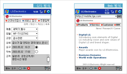
Alignment

|
 |
The standard alignment is left, and exceptions follow the guidelines. |
 |
All data should be provided within the fixed size which is 240 x 320 pixels. |
| - |
중요 내용은 고정폭 안에 위치하도록 한다. |
|
Frame (* Web Type)

|
 |
When applying frames, the standard is 1 division (top frame + main frame). Use of left frame + main frame is prohibited due to the limited width. |
 |
The following should be considered: |
| - |
Fast page loading speed |
| - |
Simple composition |
| - |
Simple frame structure |
| - |
Ease of maintenance
* The use of frames should be hidden visually (hide frame border).
|
|
Loading

|
 |
Screen should be designed to minimize loading time. |
 |
Loading status should be indicated because the loading speed is usually slow. |
 |
Cancel Loading button should be provided in order to reduce user expenses. |
|
Data scrolling

|
 |
Scroll in header area is prohibited. |
 |
According to the size and composition of the contents, horizontal and vertical scroll could be applied if unavoidable, but the use of horizontal scroll should be avoided to the extent. |
 |
The scrolling in the contents area should not exceed 2 pages ; if it exceeds, it is recommended to separate the page. |
| - |
Function buttons are provided in both top and bottom of the page in order to avoid scrolling to top. |
 |
Selecting type is preferred to direct user input. |
| - |
Select button, drop-down menu, pop-up windows |
|
Keyboard

|
 |
The layout should consider the keyboard and menu area. |
 |
Input interaction with the stylus pen should be displayed both in input screen and keyboard. |
 |
When there is keyboard input, the keyboard must be displayed. |
| - |
When there is input in the contents area, the cursor shifts automatically. |
|
Title

|
 |
C/S Type : Title bar - “ System name”. |
 |
Web Type : Title bar - “Site name” |


|
Rollover

|
 |
Rollover effect is not essential, but it is recommended to increase user interaction. |
 |
When applying rollover effect in the graphic image, the guidelines should be observed, but if not provided, it is free to apply the effect. |
|
Image 사용

|
 |
When inserting graphic images, size and loading speed should be considered. (standard : 56k/sec) |
 |
The background of the default page is basically white, but appropriate image can be applied for expressing the site identity. |
 |
Background color of all pages are basically white, and no images can be used except for the default page. |
 |
The standard image format is GIF format. |
 |
The standard photography format is JPG format, and if the color tone is simple, it is preferred to be saved as GIF file. (Test the size in both cases.) |
 |
Even if the file size is the same, the loading speed differs from the number of files. Therefore the number of files should be controlled. |
 |
The images should have no problem with copyright. |
 |
The icons should be designed coherently. |
 |
The use of photography should not be complex, but simple and clearly delivers the concept of the site or page. |

|