|

 |


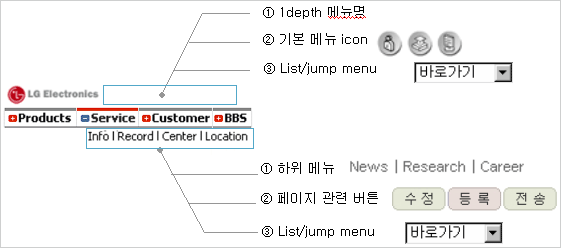
In Header area, the log, site identity, and navigation are located.
|
Policy

|
 |
C.I or system logo is positioned on the top left as a fixed area. Important utility menu can be placed in the free top right area. |
 |
When applying the LGE C.I, regardless of the language used in the system, English C.I is applied. |
 |
The C.I or logo in the header is linked to the main page. |
 |
The number of navigation menu ranges from 3 to 8, which is best fit for user cognition. |
 |
If there are too many menu items, 2 rows can be used for navigation as in Main B Type. |
 |
The navigation in the second row of Main B type applies right alignment. |
 |
If the menu in the sub navigation area is provided as below, right alignment is standard. |
|
Image Log

|
Example of Header area


|
Main A Navigation Spec

 |
 |
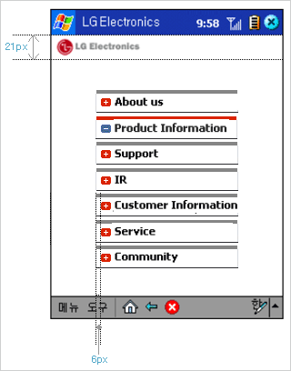
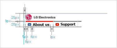
The height of ⓐ and ⓑ varies according to the number of menu items. The menu list should be displayed visually in the center, also considering the space between the logo area and the list.
|
 |
The width of the graphic line in grey dots varies according to the length of characters. Therefore, the standard is 12px between the start point of the line and the start point of the bullet, and 10~12px between the last character of the longest label and the end point of the line. |
|
|
Main A Navigation Spec


|
Navigation Spec


|
|
| |
|